Best Heatmap Tools for Websites and What Heatmaps Cannot Tell You
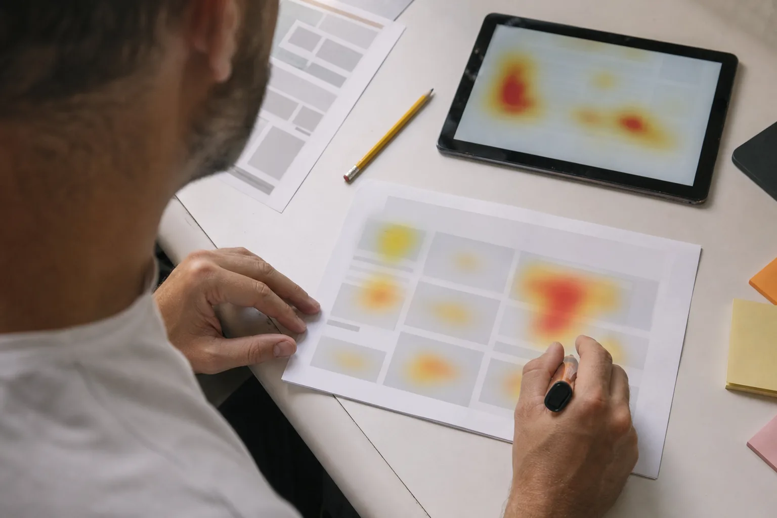
The best heatmap tools show click, scroll and move maps for every page and device, segment them by traffic source, and let you open the recordings behind any hot or cold spot. Hotjar, Microsoft Clarity and UserExplorer all do this, but a heatmap alone rarely explains why visitors behave the way they do.
Heatmaps are one of the most popular ways to look at a website, and for good reason. They turn thousands of visits into a single picture anyone in the company can read. They are also one of the easiest tools to misread. This guide covers what heatmaps are good at, which features matter when you compare tools, and the questions a heatmap simply cannot answer.
The three heatmaps you will actually use
Click maps
A click map shows where visitors click or tap. It is the fastest way to spot elements that look clickable but are not (a product image, a bold line of text, an icon) and buttons that nobody notices. When a non clickable element collects a lot of clicks, you usually have either a design problem or an opportunity: people want that thing to do something.
Scroll maps
A scroll map shows how far down the page visitors get. It tells you whether your key message, your pricing table or your call to action sits in a part of the page most people never see. Look for sharp drop offs rather than gentle slopes. A sudden fall usually means a "false bottom", a section that looks like the end of the page.
Move maps
Move maps track mouse position on desktop. They are the weakest of the three, because cursor position and eye position only loosely match. Use them as a hint, not as proof of attention.
What to look for when comparing heatmap tools
- Device split. Desktop and mobile maps should be separate. A combined map hides the fact that your mobile visitors never reach the comparison table.
- Segmentation. You want to compare paid traffic with organic, new visitors with returning ones, and visitors who converted with those who did not. A heatmap of everyone is an average, and averages hide problems.
- Dynamic content support. Menus, modals, tabs and logged in pages change after load. Good tools capture these states instead of showing clicks on top of a blank screenshot.
- Retroactive maps. Some tools only start collecting after you create a heatmap for a URL. Others build maps from recorded sessions, so you can look at a page you did not plan to study.
- A link back to sessions. When you see a hot spot, you should be able to open the recordings of the people who clicked it. This is the feature that turns a picture into an investigation.
- Privacy defaults. Heatmaps are built from the same recordings as replays, so the same masking, consent and data region questions apply. Our privacy and security page covers how we handle them.
How popular heatmap tools differ
| Tool | Strength | Limitation |
|---|---|---|
| Hotjar | Easy to set up, well known by marketing and design teams, includes surveys | Limited funnel and product analytics, so behavior and outcomes often live in separate tools |
| Microsoft Clarity | Free click and scroll maps with recordings | Shallow segmentation and funnels, no surveys or user interviews |
| Crazy Egg | Long standing heatmap and A/B testing tool for marketing sites | Less focus on product analytics inside web apps |
| UserExplorer | Click, scroll and rage click maps segmented by source and outcome, connected to replays, funnels, user profiles and an AI researcher | Paid plans only, aimed at teams that run regular product and growth work |
Feature sets change, so confirm the details on each vendor's site. If you are moving away from a free tool, our Clarity alternative page explains what changes when you switch.
How much traffic a heatmap needs
A heatmap built from a few dozen visits is mostly noise. One curious visitor who clicks every image can paint a whole section red. Before you read a map, check how many sessions sit behind it and how many of those came from the segment you care about.
As a rough guide, wait until a page has a few hundred visits per device type before drawing conclusions about layout. For low traffic pages such as a pricing page on a young product, widen the date range rather than reacting to a single week. When traffic is too thin for a reliable map, watching a dozen full sessions often teaches you more than the map ever will.
Also note what changed during the period. A map that spans a redesign, a new campaign or a price change mixes two different pages into one picture. Good tools let you split a map by date or by page version, so you can compare before and after instead of blending them.
Reading mobile heatmaps differently
Mobile maps follow different rules. There is no hover, so move maps do not exist. Taps are less precise than clicks, which makes clusters around small links look larger than they are. The fold also sits much higher, so a section that is visible to most desktop visitors may be reached by only a fraction of mobile visitors.
Look for taps on elements that are too close together, sticky bars that cover buttons, and long forms where the scroll map shows people reaching the submit button but the click map shows few taps on it. That pattern usually means a validation error appeared somewhere out of view. Opening a few of those sessions will tell you which field caused it.
What heatmaps cannot tell you
This is the part most tool comparisons skip. A heatmap is a summary of where, not why. Here are five common traps.
Popular is not the same as good
A red hot "Compare plans" link might mean visitors love comparing plans. It might also mean your pricing cards are so confusing that everyone needs the comparison. The map looks identical in both cases.
Cold areas are not always ignored
A paragraph with no clicks may still be read carefully. Text is not supposed to be clicked. Scroll depth and time on section are better signals for content, and even those are rough.
Averages hide segments
If paying customers click the API docs link and trial users click the pricing link, a combined map shows both as moderately warm. Split by outcome before you draw conclusions.
Rage clicks need context
A cluster of repeated clicks often signals a broken element, but sometimes it is a slow loading button or a visitor double clicking out of habit. Open a handful of sessions before you file a bug. Our guide on rage click tracking shows how to tell the difference.
Heatmaps do not include the people who left early
Visitors who bounced in three seconds barely appear on a scroll map of the lower page. If your problem is above the fold, the map of the rest of the page will not help.
Turning a heatmap into a decision
A practical workflow looks like this:
- Start with one page and one outcome, for example "pricing page to checkout started".
- Compare the click map of visitors who converted with the map of those who did not.
- Pick the biggest difference and open ten sessions from each group at that spot.
- Write down what you see in plain words. "Mobile visitors tap the plan name expecting details, nothing happens, they scroll back up."
- If the reason is still unclear, ask. A one question survey shown to visitors who behaved that way usually settles it.
UserExplorer does steps two to five for you on request. The AI researcher compares segments, opens the relevant sessions, writes the finding in plain English and attaches the recordings as evidence, so you can verify it in a minute rather than an afternoon. Read more on the heatmaps and AI user research pages.
Picking the right heatmap tool
For a small site with a few pages, almost any heatmap tool will show you the obvious issues. Once you run paid campaigns, test pricing or work on a logged in product, segmentation and the link from map to session become the features that matter. If you want to see what that looks like, enter your site address on the homepage to open a sample report, or check the plans on the pricing page.